Monitoring Dashboard Design Iteration

UX research, UI design, Prototyping, User Testing, Design system
May 2023 - Sep 2023
Project Overview
Anomify faces a severe issue of low usage rate, up to 95% of users dropped off after registration.
This project aimed to discover the problems, optimise the user experience and demonstrate the product's value to users.
About Anomify AI
Anomify AI, an anomaly detection platform, leverages machine learning techniques to aid companies in identifying system outliers.
Let's sync up!
Up to 95% of Anomify's users did not engage with the platform after registration.
The current challenge Anomify face was a low usage rate and high drop off. They want to know what were the main problems that led to user drop-off and what they could improve.
🎯
Business Objectives
1. Find out the true root cause
2. Improve product usability
3. Reveal Anomify's value to user
👤
Target Audiences
1. Data analyst
2. Network administrator
3. Infrastructure engineer
4. Develops engineer
5. Quality assurance engineer
Discover
Role Analysis
What IT specialist needs?
Anomify AI's target audiences are IT specialists who need to deal with large data sets and use data to help company detect unusual behaviours.
System Competency
1. High familiarity with monitoring system or other B2B data analysis platforms.
2. High proficiency in complex digital systems.
Skills and Knowledge
1. High technological capabilities.
2. Strong analytical skills.
3. Bachelor's degree in Computer Science.
4. Ability to work with multiple systems simultaneously.
Role-Related Goals
1. Find system outliers to solve organisation's problems.
2. Proactively prevent potential breaches.
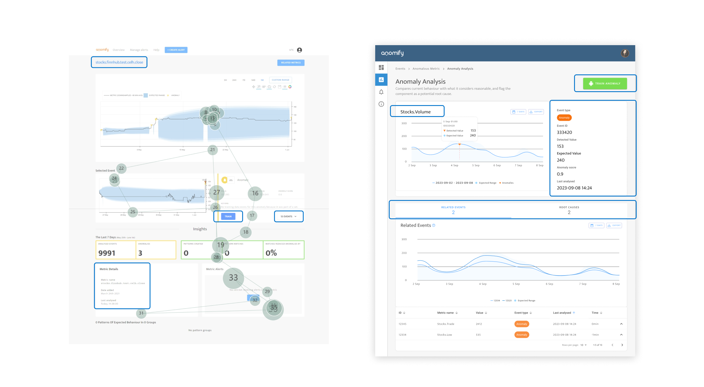
User Needs and Pain Points
Based on the pre-survey, the usability scores stood only a mere 60%.
I started with online survey and user interviews. The result shows they did love the features of Anomfiy AI, however, they expressed  it was not an enjoyable platform and most of the users mentioned did not know how to use it.
🕵️
Data Analyst
"I need to deal with large data set, the most challenge is to find the right data!"

👩‍💻
Data Engineer
"I need the features that could help me find outliers and I need to export the csv file."

👨‍💼
Lead developer
"How this app can help me reduce data errors? Now it's hard to understand"

28 participants
Root causes analysis
What’s the problem?
Based on the quantitative data & qualitative research, I gathered users feedbacks and expectations into decision matrix revealing the impacted issues that should be considered in the following design iteration.

Open Survey Responses
Problem 1
Navigation Issue
Poor accessibility
According to WCAG, it revealed many sections on Anomify's platform do not meet the qualified contrast standard.
"it does not really clarify and help reaching analytics purposes" - Participant A
"Some information in the chart is a little difficult to read." - Participant B
Problem 2
Poor Visual Hierarchy
It takes time to access information.
The current platform is a one page scrolling page which users need to scroll down to find the main area (data) which it is not easy to reach.
According to the eye tracking test, most of the users turned to ignore the navigation bar. Users mentioned they did not see the important information which is the recent event, because the session is beneath the screen.
"The user experience was not bad but, the product itself was confusing. I think it'd be more helpful to sort the anomalies in whether they were beneficial or not."  - Participant C
"I couldn’t find the train option."  - Participant D
Recent event is beneath the screen.
Users ignored the navigation bar.
Problem 3
Inconsistent Design
80% of its content come in a variety of forms and styles.
The inconsistent design caused information fatigue. Users felt overwhelmed and confused, particularly when identifying outliers and made it challenging for users to effectively navigate the platform.
Define
Project Goal
Build a unified and consistent user experience.
To build an easy-to-use platform with unified design styles across the entire product and to define a standard design principle.
Ideation
Define scope
Redefined information architecture and user flow to ensure we won't miss anything.
To better understand where users encountered problems in the process, I highlighted in red the areas in the user journey map where users encountered problems. This was also the area I wanted to focus on the most during the redesign.

Secondly, I defined the clear information architecture and user flow ensured users could analyse data with ease to ensure the seamless user experience.

Design Assumptions
Low-Fidelity Design & User Test
Assumption 1
Can the vertical menu address the navigation issue and reduce user reaction time?
Before
The important section was beneath the screen. User need to scroll down to find the data and constantly switch between table and details screens, slowing down their ability to access information.
After
Introduced a "Vertical menu" allowing users to quickly switch pages to get  information easily, improving efficiency and decision-making speed.

Assumption 2
Can the list-view improve the efficiency of data analysis?
Before
Current event dashboard display is not easy to scan the information and it's hard to do the data comparison.
After
Introduced "List View", allowing users to scan and sort data faster, improving reaction time.
Verify Hypothesises
User Test
Conducted low-fidelity prototype test to ensure our new design aligned with stakeholders' visions before deep-diving into the solution.
5 participants
💡
Lack of onboarding
They felt confused with the dashboard display and expressed the difficulty of understanding the meaning of the section.
🔍
Poor visual hierarchy
Testers mentioned they turned to miss the navigation bar and the information beneath the screen.
🟢
Poor accessibility
According to WCAG, it revealed many sections on Anomify's platform do not meet the qualified contrast standard.
Defined
Reducing cognitive overload is crucial
How might we reveal Anomify's value to users?
Based on the quantitative data & qualitative feedback, I gathered user needs and expectations into decision matrix showed the most impacted features should be considered.
Clear
Instruction
Clear visual hierarchy
Consistent
design
RWD
Delivery
Design Iteration
Streamline the data analysis experience to facilitate users’ decision-making process.
Open Figma Prototype
Ensure Consistent Design
Defined design system to ensure visual consistency across screen.
This design system serves as the basis for defining the visual language of the entire system, ensuring consistency across components and future design elements.
Before
After
Intuitive UI to response users' expectation
Onboarding assistant
Tooltips provide instruction to give users essential explanations and help.
Foldable vertical menu
The left vertical menu can give better navigation with foldable feature can save space on the screen.
Simplify data charts
The chart provided one left-side Y-axis for improving the navigation and allowed user “Export” the graph and data.
Leverage Visual Hierarchy
Leverage visual hierarchy to direct users' attention effectively
The new UIs streamlined the visual hierarchy across screens and enhance the colour contrast allowing users investigate anomaly event with ease.
Prototypes
2 clickable prototypes were made for the following user test to validatedesign assumptions.
A - List View
A table of rows would benefit from investigating a large number of anomalies
B - Card View
Card view display shows the visualisation of graphs. Users can check the data trend and outliers.
A Prototype
B Prototype
Validation
User Test & Evaluations
9 participants / 2 tests / Maze Platform
Open User Testing Analysis
All participants successfully completed the tasks without drop-offs
The overall usability scores for both prototypes exceeded 70 scores, 72 and 73 above average System Usability Scale (SUS).
Users made a decision faster without dropping off
The AVG duration time was less than 42s on each task, and it showed superior progress in reaction time. (Before the AVG was 5 mins)
Conclusion
Result & Reflection
Positive feedback, but much to be iterated.
It is evident that all stakeholders loved the new design. In the next step, onboarding system and advance features such as mathematic functions should be considered.
"In data science, it should have a function to split the dataset into train and test."
"If there's an onboarding session at the beginning, breadcrumbs or any clue what the potential path of the pages could lead to might be helpful."
"If it targets data analysis, then it should provide more functions e.g. mathematic function."
Offering two different views (List & Card) are a necessary consideration.
The test results did not reveal a significant user preference between the two prototypes as it depends on different situations. Thus, we might implement two style views of the anomaly analysis dashboard in the future.
“List format was intuitive and easier to follow!”
“The table of rows would benefit from investigating a large number of anomalies.”
“The visualisation of graphs is pleased eyes!”
What problems I met and how it can be improved?
Conducting two iterations of user testing at the same time is a challenge for users.
Because of the time limitation, I did the user test with two design iterations in order to get users' feedback.
The downside of it is users consumed more effort to go through all the test processes. To deliver small changes of UI designs for a proper A/B test would be considered in future projects.